SAYSA - Organic Restaurant
Brand Identity | Logo design
Year: 2021
Client: Universitat Oberta de Catalunya
Country: Barcelona, Spain
SAYSA is an organic restaurant located in Amsterdam (The Netherlands) based on local cuisine and sustainable products.
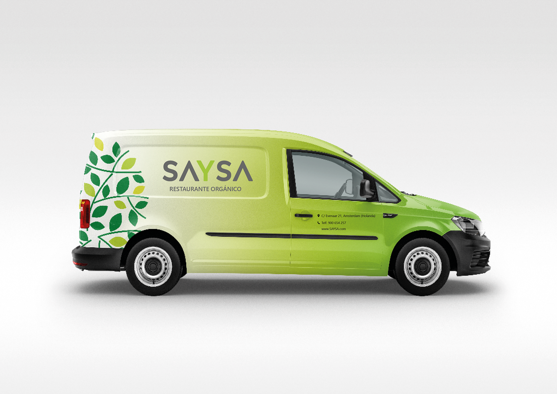
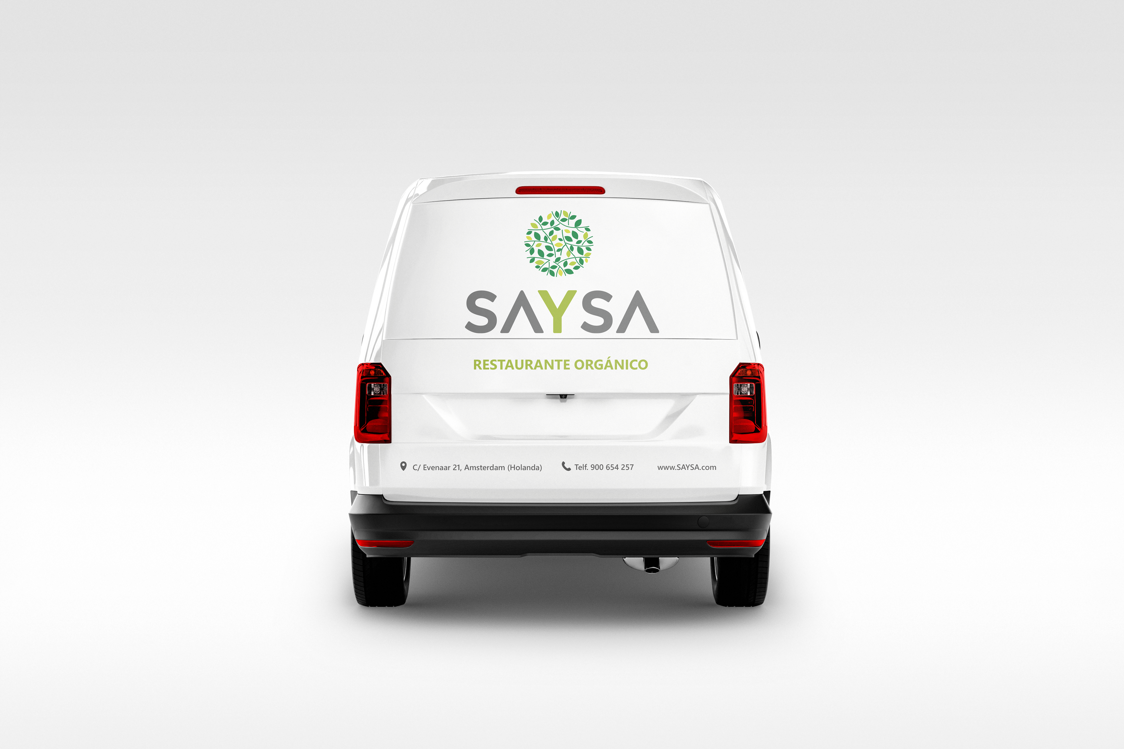
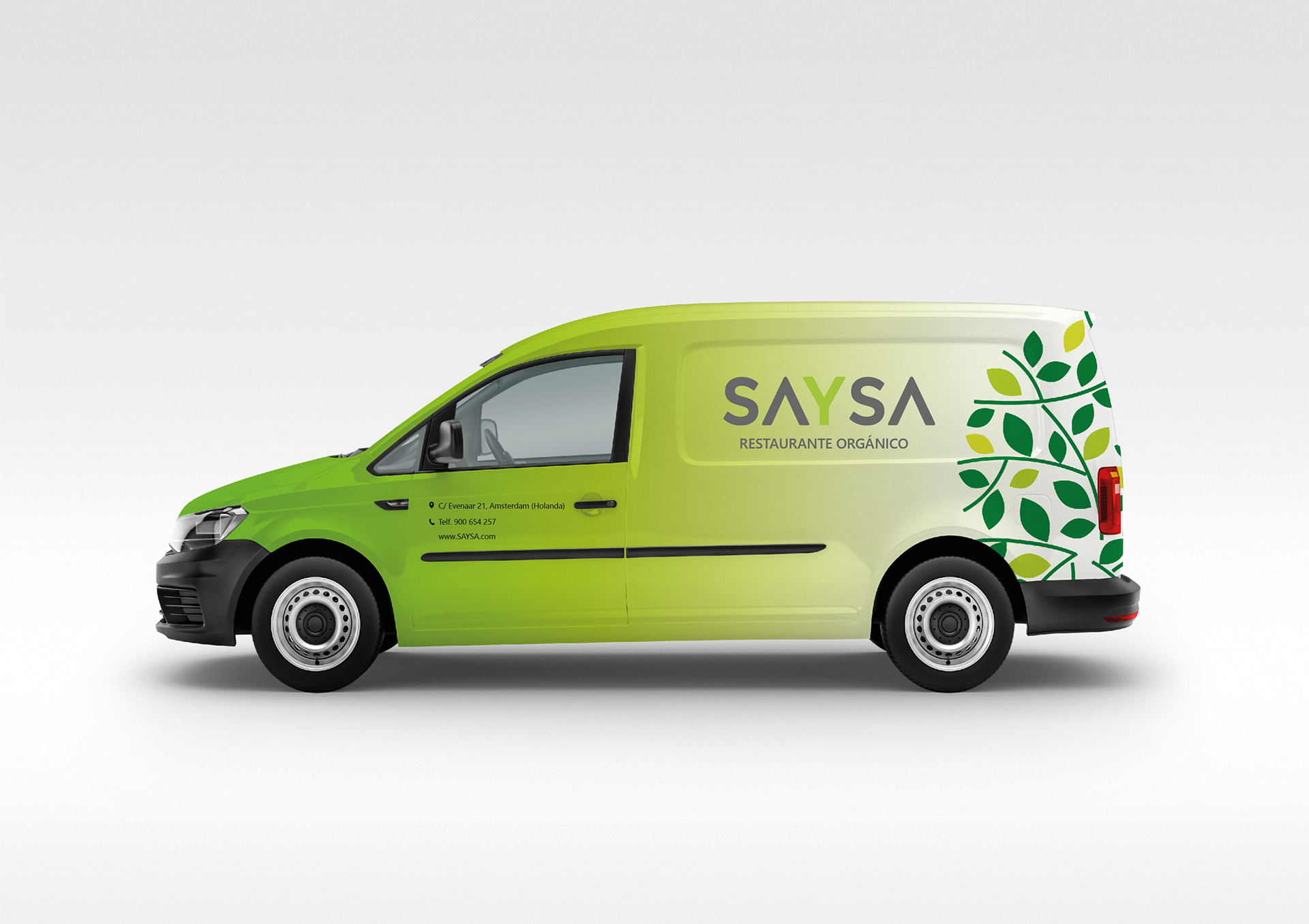
The corporate image was created and developed from its conception, including the creation of its brand logo and the corporate identity manual, which contains all the specifications of proper use of the logo.
The origin of the brand name "SAYSA" comes from the fusion of the Spanish words "Sano y Saludable", which refers to a healthy and wholesome life, which is one of the most important values that the brand wants to represent.
The symbol that accompanies the logo has been created from elements that evoke nature, such as the leaves of a tree attached to their respective branches. The top of the tree is subtly placed over the trunk, which in this case is the letter "Y" of the logotype. The graphic composition conveys freshness and elegance to the brand and, at the same time, is easily recognizable.
In addition, a mobile application has been developed from which you can make reservations, home orders and be aware of the restaurant's offers and promotions.
Furthermore, the brand image has been implemented in different merchandising materials such as stationery, T-shirts, tote bags and other accessories, in order to increase the visibility of the brand.
Furthermore, the brand image has been implemented in different merchandising materials such as stationery, T-shirts, tote bags and other accessories, in order to increase the visibility of the brand.

